 订阅
订阅html+css3实现梅花图案
来源:网络收集 点击: 时间:2024-02-18新建html文档。
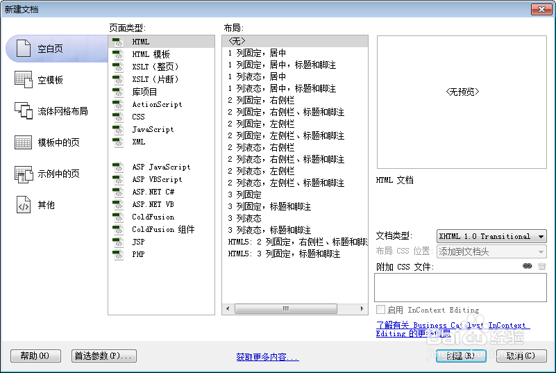 2/6
2/6书写hmtl代码。
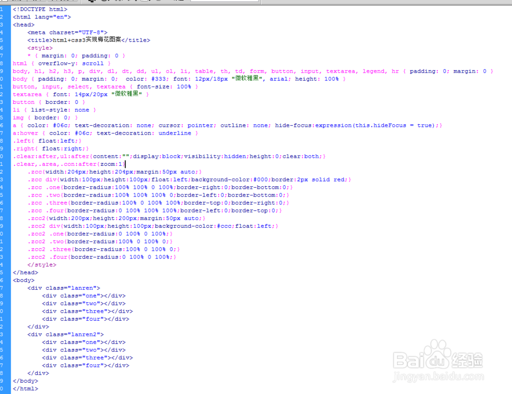
div class=lanren
div class=one/div
div class=two/div
div class=three/div
div class=four/div
/div
div class=lanren2
div class=one/div
div class=two/div
div class=three/div
div class=four/div
/div
 3/6
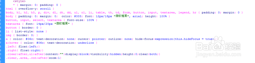
3/6初始化css代码。
style
* { margin: 0; padding: 0 }
html { overflow-y: scroll }
body, h1, h2, h3, p, div, dl, dt, dd, ul, ol, li, table, th, td, form, button, input, textarea, legend, hr { padding: 0; margin: 0 }
body { padding: 0; margin: 0; color: #333; font: 12px/18px 微软雅黑, arial; height: 100% }
button, input, select, textarea { font-size: 100% }
textarea { font: 14px/20px 微软雅黑 }
button { border: 0 }
li { list-style: none }
img { border: 0; }
a { color: #06c; text-decoration: none; cursor: pointer; outline: none; hide-focus:expression(this.hideFocus = true);}
a:hover { color: #06c; text-decoration: underline }
.left{ float:left;}
.right{ float:right;}
.clear:after,ul:after{content:;display:block;visibility:hidden;height:0;clear:both;}
.clear,.area,.con:after{zoom:1}
/style
 4/6
4/6书写css代码。
style
.zcc{width:204px;height:204px;margin:50px auto;}
.zcc div{width:100px;height:100px;float:left;background-color:#000;border:2px solid red;}
.zcc .one{border-radius:100% 100% 0 100%;border-right:0;border-bottom:0;}
.zcc .two{border-radius:100% 100% 100% 0;border-left:0;border-bottom:0;}
.zcc .three{border-radius:100% 0 100% 100%;border-top:0;border-right:0;}
.zcc .four{border-radius:0 100% 100% 100%;border-left:0;border-top:0;}
.zcc2{width:200px;height:200px;margin:50px auto;}
.zcc2 div{width:100px;height:100px;background-color:#ccc;float:left;}
.zcc2 .one{border-radius:0 100% 0 100%;}
.zcc2 .two{border-radius:100% 0 100% 0;}
.zcc2 .three{border-radius:100% 0 100% 0;}
.zcc2 .four{border-radius:0 100% 0 100%;}
/style
 5/6
5/6代码整体结构。
 6/6
6/6查看效果。
 HTMLCSS3CSS梅花图形CSS网页前端
 版权声明:
1、本文系转载,版权归原作者所有,旨在传递信息,不代表看本站的观点和立场。
2、本站仅提供信息发布平台,不承担相关法律责任。
3、若侵犯您的版权或隐私,请联系本站管理员删除。
4、文章链接:http://www.1haoku.cn/art_70456.html